Friday, December 12, 2014

Project 4- Balance and Contrast

For this project, we took photos of instances that illustrate balance and contrast.

Radial Balance- This photo is of the underside of a lamp.

Symmetrical Balance-  This photo is of an African mask my family received as a gift.
Texture Contrast-  This photo is contrasting the smooth metal with the rough stone underneath it.
Color Contrast- This photo contrasts the complimentary colors red and green of two plants growing with each other along a fence.


Project 4- Kaleidoscopes

For this project, we took various photos of objects manmade or in nature and edited them in Lightroom to make kaleidoscopes.  

Statue

Tree
Tree

Tree
Fabric Design


Project 4- Diptychs and Triptychs

For this project we made various diptychs and triptychs to contrast different scenes and textures.  Many of the photos are edited (cropped, saturated, etc.) to emphasize the comparison or contrast between the photo they're paired with.  
Portland Cityscape vs. Skyline Memorial Gardens
Texture Contrast Diptych
Stone Path Vs. Spotted Blanket
Airplane Wing
Texture Contrast Triptych
Bark Contrast

Wednesday, November 26, 2014

Balance and Contrast

This photo illustrates a strong contrast in scale because the massive clouds make the house look tiny.
Photograph by: Manuel Cosentino.

This photo shows a contrast in color with the complementary colors blue and orange.
Photograph by: Brian Skerry
In this photo, there is a clear contrast in texture between the rough cliff and smooth ocean surface.
Photograph by Jimmy Chin. 
This photo illustrates radial balance because of how the design of the tower stretches out from the middle.
Photograph by Ricard Pare.  

This photo of the Yangpu Bridge shows symmetry because it mirrors itself across the line down the middle.
Photograph by Marc Riboud.


Friday, November 21, 2014

Project 3- Colors and Grids

For this project, we explored colors.  With our colorful photographs, we created 4 grids using Lightroom.  These grids were made of cool colors, warm colors, complementary colors, and monochrome.  Our last photo was not made into a grid, and was intended to set a certain mood.  I took all new photos for this project and took advantage of the Portland fall colors to make the color grids.    


cool colors


Warm Colors


Complementary Colors
Monochrome

Mood- This photo has a mysterious and eerie mood to it.


Monday, October 27, 2014


"After All Night"-Corey Arnolds
This photo has a combination of both warm colors and cool colors, but the blues and grays seem to taker over and give the photo a peaceful and even lonely feeling.


Sunday, October 26, 2014

Project 2- Framing and Composition Techniques

For this project, we took numerous photos to fit the 8 framing and composition techniques, rule of thirds, frame within a frame, close up, bird's eye view, bug's eye view, leading lines, diagonals, and filling the frame.  We then chose our best 3 photos of each of the 8 techniques and edited at least 1 of the photos from each technique.  The following photos include my 8 best edited photos (1 from each of the techniques) and a contact sheet of 36 photos that include both my original and edited photos.   
Contact Sheet
Rule Of Thirds  

Frame Within a Frame
Close Up
Bird's Eye View
Bug's Eye View

Leading Lines

Diagonals

Filling the Frame
EXTRAS:
Here are 3 of my favorite additional photos that I did not edit but wanted to post on the blog.  

Bird's Eye View

Fill the Frame

Leading Lines


Wednesday, September 24, 2014

Project 1


I cropped and centered this photo so that the telephone was the main focus, and put it in black and white with high contrast in order to give it an eerie feeling.


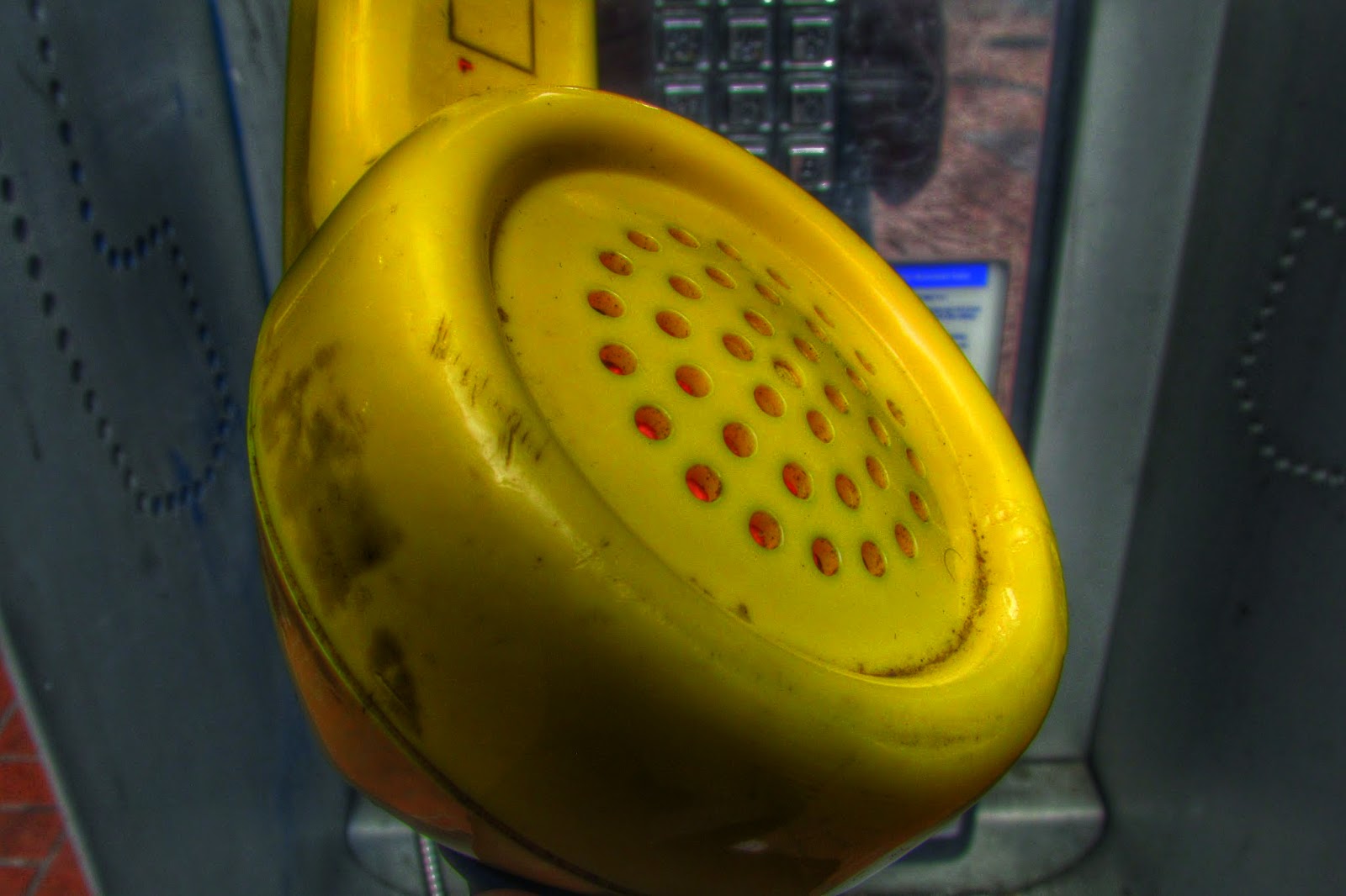
I cropped the top of this photo so that the main focus was on the transmitter, and added a filter that saturated the colors a bit more, making the phone look more yellow, and the transmitters' holes have an orange glow.


I cropped and centered this photo so that the phone was the center and vertical in the frame.  I added a filter that darkened the background a bit and brought the attention onto the phone.


For this photo, I cropped the outer edges and brightened the photo so that my cat's features were more noticeable.  I added a filter that gave the photo an "old family album" feeling.


Another picture of my cat, from below our balcony.  He was peering at the camera from through the bars so I decided to crop the image so that he was the center focus, and added a black and white filter in order to give it a dark feeling.


For this photo, I added a filter that fuzzed the edges of my cat's fur, which gave the photo a warm feeling.  It almost looks like a painting.