Friday, December 11, 2015

Project #2: Angles, Elements, and Filters

Filter Tests for Photo 1:


Print:
Photo 1 - I took this photo of two figurine elephants my grandma that decorate my house.  This print was developed at Filter 3, F-stop 11, for 5 seconds.

Filter Tests for Photo 2:


Print: 
Photo 2 - I took this photo of wooden stairs leading to the beach at my ConTeam coaches'  beach house.  This print was developed at Filter 3, F-stop 11, for 5 seconds.

Filter Tests for Photo 3:


Print: 
Photo 3 - I took this photo at the Oregon Coast.  This was developed at Filter 3, F-stop 11, for 5 seconds.
Filter Test for Photo 4:


Print:
Photo 4 - I took this photo of my brother during Thanksgiving break in Southern California.  This print was developed at Filter 3, F-stop 11, for 5 seconds.


Wednesday, October 14, 2015

Project #1: Early Processes

My idea for this project is inspired by my mom.

One of her favorite things to do is garden.  Our house in Southern California had the best-looking front lawn in the neighborhood not only because of the vibrant and colorful flowers, but how the flowers were arranged-- my mom had mastered the art of gardening.  This passion didn't stop after we moved to Portland, Oregon, despite our lack of yard space.  My mom continues to plant a variety of flowers in the front yard (and once again, we have the best looking lawn in town), and any other plants, flowers, or vegetables that don't fit in that limited space are placed into planters on our two balconies.  All of the plants used for my project are from her garden.

I wanted the plants to form animal silhouettes of a dog, cat, horse, and pig because my mom is a veterinarian. She works with dogs and cats but has always wanted to work with farm animals.


Process:

First, I arranged plants randomly on the photo-paper (covering the paper completely) and exposed for 5-6 seconds on F.11.  Then I removed all the plants off the paper, placed an animal stencil on the paper, and exposed for 5-6 seconds on F.11.  There were some variations of F-stop and the time of exposure on some of the Photograms because some plants were thicker than others. I also used different enlargers, all of which are slightly different.

I really enjoyed this process because of its focus on texture and light.  I will pursue and experiment with this process throughout the year.

Thursday, October 1, 2015

Old Process, New Artist


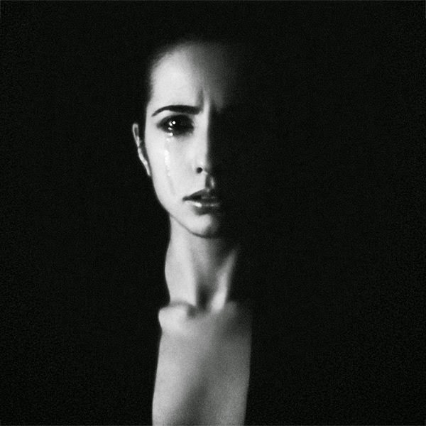
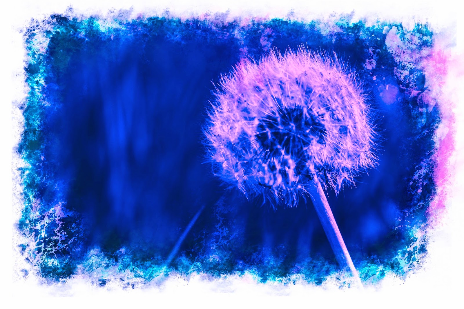
I absolutely loved Egill Ibsen's Cyanotypes and acrylics because of his use of color to create a mood and sense of depth within his photographs.

The Cyanotype process is below: (from this link)
http://www.alternativephotography.com/wp/processes/cyanotype/cyanotype-classic-process

"The cyanotype process is simple. It can be done easily in a few steps:
Mixing chemicals
The cyanotype is made up of two simple solutions.
  • Potassium ferricyanide and Ferric ammonium citrate (green) are mixed with water separately.
  • The two solutions are then blended together in equal parts.
Preparing the canvas
  • Paper, card, textiles or any other naturally absorbent material is coated with the solution and dried in the dark.
Printing the cyanotype
  • Objects or negatives are placed on the material to make a print. The cyanotype is printed using UV light, such as the sun, a light box or a UV lamp.
Processing and drying
  • After exposure the material is processed by simply rinsing it in water. A white print emerges on a blue background.
  • The final print is dried and admired."
Ibsen goes over his photographs with acrylic paint to add color.

I also loved Harry B Houchins' (University of Oregon's photographer, whoo!) and Crystal Edwards' Gum Bichromate photographs, which also had unique uses of color.

The Gum Bichromate process is below, from Peter J. Blackburn: (from this link)
http://www.alternativephotography.com/wp/processes/gum-bichromates/an-introduction-to-the-gum-bichromate-process

"1. Gum printing is a contact printing process. A good print begins with a good negative. You must have a negative produced in the actual size of the finished print. It can be as simple as taking a digital image and using photo manipulating software to invert (and flip) the shot to a negative making an inkjet print on paper or transparency film. You might also consider using an imagesetter to make quality negatives. Try to start with negatives that have good (not necessarily high) contrast and density.
For many years (and occasionally still) I made negatives using the analogue method of enlarging medium format transparencies onto orthochromatic film. I developed the film in dilute Dektol (1:20).
Much has been written about producing digital negatives and using software for alternative processes. Indeed, a properly made negative is one more key, among the many keys, to creating technically and esthetically pleasing prints. I would advise you to research, experiment, and practice!

2. With your negative ready and under subdued light or a safelight, combine one part gum arabic, one part dichromate, and a small length of watercolor from a tube. As an example for a typical 8 x 10 print, combine 3 eyedroppers full of gum with 3 eyedroppers full of dichromate. Then add about 2-3cm of watercolor from a tube. Mix thoroughly! With experience, you will discover that some mixtures require more pigment, others less depending upon, among other things, brand and color. Remember-mix thoroughly and occasionally stir as you use it!

3. After you have mixed thoroughly, brush the emulsion onto the paper over an area slightly larger than your negative. Brush as quickly and evenly as you can. You may need to switch to a dry brush to help smooth the emulsion. Try not to lay the emulsion on too thick or thin, with your primary aim keep it even. Here is where finesse plays an important part in the process.

4. Allow the emulsion to dry. A fan or a blow dryer set on the cool mode will help to speed the process along.
5.. Place your negative on top of the dry emulsion taking care that the "emulsion" side of your negative is in contact with the gum emulsion. Insert into your contact printer or sandwich with your plate glass...

6. Now expose your image to a UV source. A sunlight exposure may take from 1 to several minutes depending upon many factors such as pigment choice, gum/sensitizer ratio, time of day/season of year (if using the sun), and negative density. As an arbitrary starting time for your very first print, set the timer for three minutes and adjust your next prints accordingly.

7. When the timer goes off, remove your print from the contact printer or plate glass. Rinse the emulsion for a few seconds (5-10) under a very gentle stream of water to remove the least affected dichromate first. You will probably see some orange solution wash away almost immediately. Why let your paper soak unnecessarily in dichromate that otherwise can easily be removed by a brief initial rinse? After the rinse, place your paper face down in a tray of water for 5-15 minutes, then gently into another tray for an additional 5-15 minutes, then finally (if needed) into a third tray for the same amount of time. Your goal is to develop an acceptable print within 20 – 30 minutes. It is not unusual to use a small brush to help clear away small areas of unwanted pigment. However, if you find that the print is not clearing away in the allotted time or you need to scrub your emulsion to remove unwanted pigment, try exposing the next print for a shorter period of time. On the other hand, if the emulsion has swept off your paper or is flaking and fragmenting during the brief initial rinse time or in the first wash, try doubling or tripling your exposure time.

8. Now you may hang your print to dry or place face up on a drying screen. Afterward, it is usually recommended that another coat be applied of the same color or perhaps another color over top of the first layer to help improve the tonal range and density of the print. Simply repeat steps 2 through 8. After the last coating sequence, when your paper has dried, some printers suggest to remove any residual dichromate (indicated by an orange stain especially visible in the highlights) by briefly soaking the paper once more in a 5% (or less) solution of potassium metabisulphite."

Friday, April 24, 2015

Project 9- Fine Arts and Commercial Portraits

Commercial:
I love advertisements that use this color dulling technique because it draws your eyes to the advertised item and makes it seem as if it is the most important thing in the photo.

Fine Arts:

My dad loves to play the bass and has been playing as long as I can remember.  I took numerous photos of him playing and singing then edited the photo I liked best to be black and white, then posterized it in Photoshop.  Because he plays in his office, the background of the photo was really busy so I cut it out and replaced it with a black lighted background.
This photo was taken with my phone and edited in LightRoom.  I boosted the saturation of the green grass and her blue jacket while making her skin softer and well-lighted.  I also added a vignette around her body so that our eyes are drawn to the middle of the photo.  This photo is fun because my subject is usually known to be a very energetic person, so it's such a contrast to have her so relaxed.


Fine Arts Portrait: Lighting and Use of Color

Anna Shakina- http://www.artlimited.net/image/en/347412

Julia Noni

http://www.julianoni.com/


Commercial Portraits: Use of Color and Composition

Sølve Sundsbø- http://www.designscene.net/2012/08/herieth-paul-kel-markey-gucci-i-d-pre-fall-2012.html
Christian Oita

http://www.creativebloq.com/art-magazine-covers-20-incredible-examples-2012-1212728?page=1


Thursday, April 2, 2015

project 8- Surrealism and Photomontage


For this project, I attempted to create an image of various animals either on their own or combined into giants.  The cat and squirrel are living beings whereas the dog and elephant are statues.  The background or setting is simply tall grass from a garden.  This project was difficult both technically and creatively (because we were given the tools to create pretty much any image we wanted to) but this challenge also made the project very fun.  

Friday, March 13, 2015

Project 7- Alternative Processes Through Digital Means


 In the past, photographers took photos and engaged in a specific photographic process that gave their photos a particular look, creating a daguerreotype.  Through digital editing on Photoshop, I was able to take an original photo and give it the properties of an aged, framed, black and white photograph.


Cyanotypes are photographic blueprints.  Again, I used photoshop to imitate the look that cyanotypes have.  I really like how nature is used as subjects for this photographic style so I choose to use flowers as my subjects.


Gum Bichromate is also a photo printing process that uses light sensitivity (very similar to cyanotypes).  I chose a dandelion and an African mask I have in my house to use as subjects.  


Monday, March 9, 2015

Artists of the Surrealist Movement

Surrealist art is typically art that is seen as the combination of creative images that usually don't belong together in order create a dream-like and abstract effect.  These paintings were typically seen as art that reveal ideas and images from the unconscious.  I like how both of the paintings posted below intertwine images of nature and people to express an idea.
Salvador DalĂ­
Remedios Varo


Friday, February 20, 2015

Project 6- Multiple Images Techniques

Multiple Exposure Images:

This is a multiple exposure image of an elephant statue in our house layered over a photo of bright yellow colored leaves.  To edit it, I increased the whites and boosted the yellow of the leaves.  
This is a black and white multiple exposure image of a cello layered over a figurine of a bass player.  I attempted this photo as a comparison of two musical subjects and was not entirely satisfied with my cropping and clarity of the photo.  However, it was fun testing out this method of multiple exposure techniques.


High-Dynamic Range (HDR) Image:

This is an HDR photo of my street during the evening.  I took two photos with my phone in the same position to get the two exposures of the scene.  In Photoshop and Lightroom and boosted the saturation and vibrance of the colors to create a very colorful image.  
Panoramic Image:

This panoramic photo of a freeway bridge was taken during a class walking field and stitched together in Photoshop.  I edited the photo to have a bluish tint, boosted the contrast, darkened the blacks, and lightened the whites.